


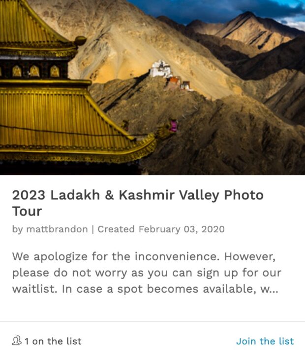
Kathmandu: In Black and White


The same shot as below but processes in both Lightroom and On1’s Perfect B&W.
f/10, 1/480 sec, at 14mm, 200 ISO, on a X-Pro1

The classic shot of Boudhanath. Does color add to the story?
f/10, 1/480 sec, at 14mm, 200 ISO, on a X-Pro1
I am going to make a confession: One of the things I have always struggled with sense going digital is black and white photography. When I was shooting film almost half the time I was shooting Tri-X Pan or T-Max. When I would shoot a new story or in university for the yearbook it was a given, we shot black and white. So I developed a sense of seeing in black and white, strange I know. But I do the same thing with lenses, I develop a sense of what a shot will look like with a 16 mm or 200 mm lens. But once I started shooting just digital, that sense of seeing in black and white left me completely. Now it is an effort to produce any photo in black and white. Everything is in color. You might say I am black and white blind.
One way I have seen to get around this blindness is to be methodical. I have to ask myself, does the color add anything to this image? Frankly, much of the time it does. Maybe another quarter of the time it could go either way. But sometimes it is just clear. The image should be in black and white, plain and simple. Here are a hand full of shots that could go either way or just look better in black and white.

Here is a wide angle portrait of a Nepali man on the street.
f/2.8, 1/220 sec, at 14mm, 200 ISO, on a X-Pro1

A priest sits on the steps of his temple.
f/1.4, 1/170 sec, at 35mm, 200 ISO, on a X-Pro1

A Kali worshiper.
f/3.6, 1/15 sec, at 14mm, 3200 ISO, on a X-Pro1

A temple sweeper.
f/3.6, 1/40 sec, at 14mm, 200 ISO, on a X-Pro1

A shop keeper comes out to see what I am doing.
f/2.8, 1/105 sec, at 35mm, 200 ISO, on a X-Pro1

f/1.4, 1/1000 sec, at 35mm, 200 ISO, on a X-Pro1
Hi Matt
First, regardless of final output, these are nicely composed.
While I can easily imagine the engaging colour available in some of these, I really find the BW intriguing. I become more curious, and love to trace out the lines of detail. Well maybe that’s just me.
Thanks Stephen, One thing there is no doubt about. When in Back and white any color distraction are eliminated. As in the last photo in the upper right corner. This photo just can’t be in color, that buildings bright red and over powers the man visually. So B&W does have a purpose in composition as well as aesthetics
I agree Matt, B&W makes more sense here with the thick clouds and the murky and dull looking golden top. I went there twice once on a clear day with blue sky and another time in the evening where the entire place was cast in a warm evening glow. Color made more sense in those circumstances. Nice B&W work.
Thanks Prasad for your comment.
hey matt — i’m not a pro, not even “serious amateur,” but i do love pictures and seeing what speaks to me when i see a shot; why do some really grab me and others leave me with no reaction… anyway– i think for me the response i get when i see the b&w shots above is, it really forces me to concentrate… focus on the main point of the picture: the person’s face, usually: what’s he/she doing, thinking… why? who are they… what’s going on in their life? — i don’t know, it just encourages me to not go to the stuff in the background or periphery, but to ask, “what’s the big/main idea here?”
that’s my take — and you know, (again, for me) it really works!
Thanks Keith, that reminds me of the Ted Gran quote, t“When you photograph people in color, you photograph their clothes. But when you photograph people in Black and white, you photograph their souls!” Franky, I am not sure I agree with that. But it does sort of match with what you wrote.
Hi Matt, great shots, I too am now looking back at B&W having lost my way since the film days. I have started a 52 challenge this year using my X-Pro1 in B&W only which is indeed challenging, it can be viewed here http://www.ephotozine.com/user/topsyrm-149719/blog this post helps me stay focussed, thanks.